Blog
November 4, 2021
Why patients aren’t using hospital software... and what to do about it

Written byDavid Wright • Chief Operating Officer
While 90% of health systems now have patient portals, less than 25% of patients are adopting them. That’s a shame, considering that your health system has likely spent millions of dollars for this platform. It’s also not uncommon. In our work at Vital, I’ve seen the usage rate of other hospital software – patient education tools for inpatient, for example – and it rarely tops 10 - 20% adoption. Vital Emergency guides patients & families through an emergency department visit averages 50-60% adoption, and at children’s hospitals, 60%+. How is it that we’re able to get 3-5x higher usage?
It wasn’t always that way. Vital started out with 25% adoption. Solid, but nowhere near where we’re at today. Let’s start with what we did right from the beginning.
Strong, selfish value proposition
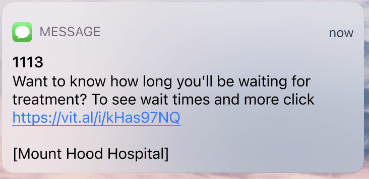
What’s the #1 thing patients in the ER care about? How long am I going to be waiting…
Guess what we emphasize in virtually every invite SMS we send out? Wait times. We also “prime the pump” by asking registration staff to say, “This ER keeps patients up-to-date on wait times using text messages. What’s the best mobile number to reach you?”. This increases mobile phone collection by 5-10% which helps downstream with both billing and notifying patients of abnormal results.

No usernames & passwords
The last thing a sick patient wants to do is create a new username and a password that’s “at least 8 characters, using at least 1 of uppercase letters, symbols, and numbers”. That isn’t a great user experience. But you need to make things secure….
How did we do it?
We use an invite link that’s more like a password reset link. The registration desk validates the patient’s ID and takes a mobile number, taking the sign-up burden off the patient.
Patients click the link (for security, it can only be clicked once), and validate with a last name and/or date of birth. Easy. Secure even if the SMS were intercepted (you can only try a couple of times).
That got us to 25%. How did we double it?
A/B test everything... and throw in a C & D test, too
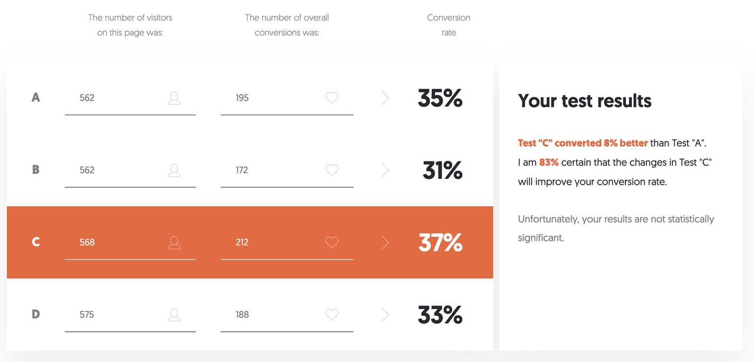
We’ve tested around 20 different invite messages. Anyone on our team with an idea can propose something and we’ll test it. Someone once proposed “Click here for a website about your visit: https://vit.al/” which I thought was incredibly nonspecific (didn’t mention any key features). It beat my best draft at the time, and I learned that a CEO’s opinion is easily defeated by data.
With an SMS shortcode, you are required by carriers to always include the source, [Vital - Greenwood Hospital], in your message. But the regulation doesn’t specify where. We tested it as a prefix, a suffix, with “Vital” being before and after the hospital name, with an abbreviation of the hospital name, and with the name of the health system instead of the name of the hospital. A/B testing is about making very small changes. Individually, these may only add up to 5-10% improvements. Collectively, they are huge.
Speed matters
Most emergency departments are on the ground floor, in a big concrete building. They have notoriously bad wifi and cellular signal strength. Forget 4G/LTE/5G, think 3G speeds at best. A typical web application, with all the buttons, graphics, and code, tries to load all or most of itself immediately. A well-optimized website might be a megabyte or two. But on a slow connection, this is forever, and patients “bounce”. After all, they’ve only seen an invite SMS at this point, they don’t know if Vital Emergency is going to be beautiful (we think it is!) or crap, so there’s a low tolerance.
We measure our speed across many carriers, across many geographies, and many web browsers. We load as little as we can. We use a “skeleton” graphic, which is like an outline of what the page structure will look like, when content eventually loads. The idea was to give the eye something immediately, and make it look good. We did, and won a 12% improvement.
Ask for as little information as possible
At this point, we had a strong, resonating message with a great-looking, fast-loading web application. What was the hang-up? To find out, we graphed our usage “funnel” and paid attention to the invite link clicked with unsuccessful logins.
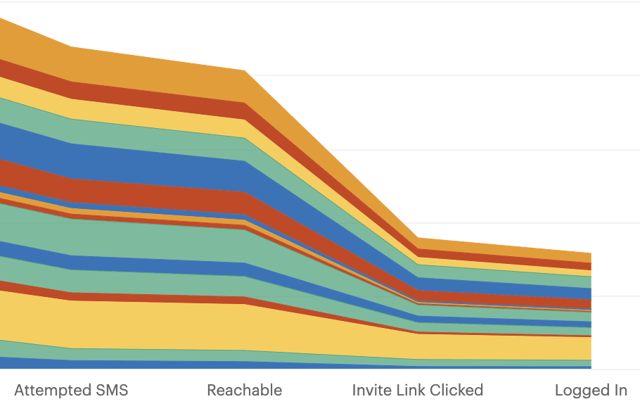
Even though SMS is encrypted and secure on all the major carriers, SMS as a protocol is not guaranteed secure, and this is healthcare where security is paramount. Therefore, we ask patients to confirm their last name and/or DOB after clicking the SMS invite.
It turns out hyphenated last names were problematic. Should “Smith-Waterman” be a match? Should we allow “Smith” “Waterman”? Is the dash optional? Same problem with accent marks (ümlauts!) and names like “O’Connor” which may or may not have an apostrophe. Relax your tolerances. It’s clearly the right person trying to login, and not a malicious hacker. But if the name is too far off, lock it down fast!
We ran into similar roadblocks when it came to terms & conditions. Do you really need someone to click a checkbox agreeing to T&Cs? We asked our healthcare attorney. The short answer: no, so long as the agreement was clear and not hidden at the bottom of the page.
Conclusion:
This is a data-driven, consumer-oriented approach. It’s why Vital has insanely high adoption of it’s Vital Emergency product (for patients in their 20s and 30s, it’s not uncommon to see 70-80% adoption). As the former Founder & CEO of Mint.com, which grew to 20M+ users in the US & Canada, I knew the general Silicon Valley rule: for the first 6 months of a product, roughly half your engineering/product/company effort should go to making sure the first-time user experience is smooth and optimized. When it is, everything downstream – follow-up appointments, driving ER patients back to the health system patient portal, sharing live status with family members – is lifted too.